Brand and visual identity
Sampo was founded in 1909. Since then, the Sampo logomark and visual identity have evolved with the time.

Sampo plc's emblem is the Sampo Group logomark. The history of the Sampo logomark traces its roots to the foundation years of the company at the dawn of the 20th century. Since then, the logomark and logo have evolved with changing times and needs, as has the company’s visual identity. Sampo has operated both in insurance and banking businesses, and its visual identity has gone through many changes over the years. The Sampo logomark was designed by Kyösti Varis in 1980 and updated into its present form in the early 2000s.
The logomark is used today by Sampo plc, the parent company of the Sampo Group. Sampo's customer brands If, Topdanmark, and Hastings each have their own logomarks, visual identities, and brand strategies.
Look and feel reflect the business
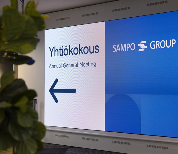
Sampo’s visual identity is based on the logomark, the use of select colours and fonts, as well as the abstract motifs typical for Sampo. Sampo’s look reflects the cornerstones of its business: stability, responsibility, risk management, and expertise. The company seeks to maintain an elegant and dignified, yet modern style.
Sampo’s visual identity is displayed on the company’s website and social media channels and used in Sampo’s publications and events.
A brand is more than just a logomark: a strong brand is a sign of awareness and appreciation. Sampo's brand became a household name when Sampo was an insurance company, and awareness increased even further after the Group entered banking as a result of the Sampo-Leonia merger. At the time, the company had a visible high-street presence, serving both private and corporate customers directly.
Today, Sampo Group is the leading P&C insurance group in the Nordics and with presence in the Nordics, the Baltics, and the UK. Sampo Group and its brands are reaching beyond Finland.
Updated